Boundary File Data Extraction
Published:
Familiarizing with shapefiles
Shapefiles are a must when doing any sort of mapping but what is often forgotten is the amount of data actually stored within them. To access it, first we’ll load in the packages we need in R and then read in the shapefile.
library(sf)
library(dplyr)
Next, we’ll load in the shapefile and convert it to simple features which will give us a dataframe to work with. You’ll notice I will be using the pipe operator %>% often in my code. This is to save space and time by running multiple steps at once. In this example I’m interested in looking at the information contained in Statistics Canada’s 2016 census subdivision (CSD) boundary file. Of course, the same analysis will work for any shapefile you use.
csd <- st_read(".../datapath/census subdivisions", stringsAsFactors = FALSE, quiet = TRUE) %>%
  st_transform(4326)

View(csd)
This returns a dataset of the information contained in our census subdivision shapefils which has 19 columns! It gives us variables such as:
- CSDUID (every CSD’s unique ID number)
- CSDNAME
- CSDTYPE (township, city, reserve, etc.)
- CMANAME (the census metropolitan area it is located in)
- ERNAME (the economic region it is located in)
- CDNAME (the census division it is located in)
- PRNAME (the province it is located in)
- SACTYPE (how rural it is on a scale 1-7 with 1 being a CMA and 7 being completely rural)
And from all these we’ll only select CSDUID, CSDNAME, and SACTYPE which correspond to columns 1, 2, and 14. Make sure to convert CSDUID to an integer so it will be compatible later with our data column.
csd <- csd[, c(1,2,14)]
csd$CSDUID <- as.integer(csd$CSDUID)
As you’ll find out if you’re paying attention to your data sizes, this file is oddly large thanks to the geometry data which is normally used for plotting data. Since we won’t be doing that in this lesson, we can drop it and save some computing power:
st_geometry(csd) <- NULL
Combining shapefile data with census data
The last variable SACTYPE is of particular interest to me and policy makers because we can now categorize every region based on how rural it is and combine that with census data.
So let’s say we want to look at income levels by CSD and see if there’s a difference between cities and rural regions. We already have every CSD and how rural it is so now all we need is household income which can be found here. Download the .csv file and load it into R.
data <- read.csv("C:/Users/wesee/Documents/98-400-X2016099_English_CSV_data.csv", stringsAsFactors = FALSE)
This again has a lot of columns but we are only interested in two:GEO_CODE..POR. and Dim..Household.income.statistics..3...Member.ID...3...Median.after.tax.income.of.households.... or to simplify it, columns 2 and 14. And specifically from column 15 we want to select Total households. The other thing we need to do is change the names of these columns after we select them:
data <- data[data$DIM..Household.type.including.census.family.structure..11. == "Total - Household type including census family structure", c(2,14)]
colnames(data) <- c("CSDUID", "AT_Income")
I chose these names so we can do a join on CSDUID between the shapefile data and the census data while AT_Income simply means after tax income. And from here we just need to do an inner join to merge the data frames together:
data_shp <- inner_join(csd, data)
attach(data_shp)

data_shp <- data_shp[!grepl("x", data_shp$AT_Income),]
The last command removes any missing variables from the census income data (which were stored as “x”). And now we have a fully functional dataset that we can do whatever we want with it!
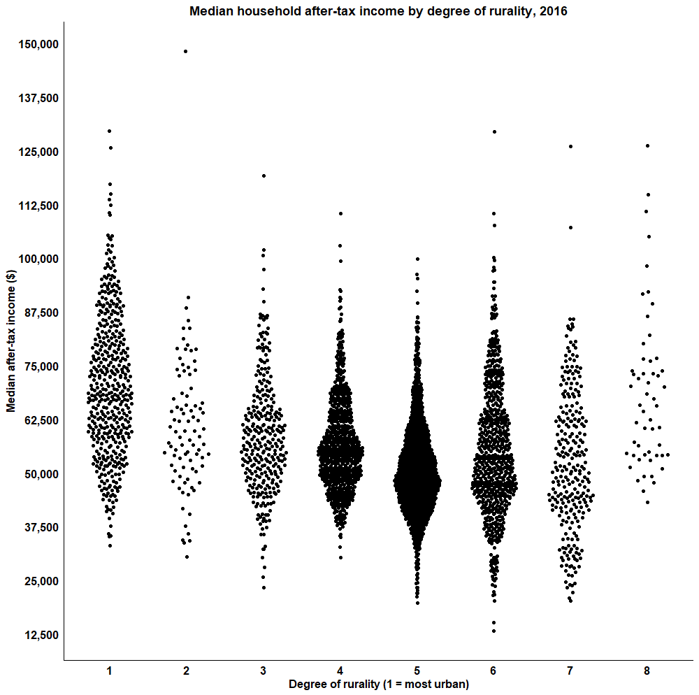
Let’s plot it as a beeswarm graph! This style is really neat and comes from ggplot but requires its own library as well.
library(ggplot2)
library(ggbeeswarm)
income_graph <- ggplot(data=data_shp,aes(x = as.factor(SACTYPE), y = as.numeric(AT_Income))) +
  geom_quasirandom(width = 0.3) +
  scale_y_continuous(breaks = seq(0,150000, 12500), labels = c("0", "12,500","25,000","37,500","50,000","62,500","75,000","87,500","100,000","112,500","125,000", "137,500", "150,000")) +
  theme_classic() +
  ggtitle("Median household after-tax income by degree of rurality, 2016") +
  ylab("Median after-tax income ($2016)") +
  xlab("Degree of rurality (1 = most urban)") +
  theme(plot.title = element_text("arial", "bold", "black", hjust = 0.5), axis.title = element_text(colour = "black", size = 12, face = "bold"),
  axis.ticks = element_blank(), axis.text = element_text(colour = "black", size = 12, face="bold"))

income_graph