Chord diagram visualization in R
Published:
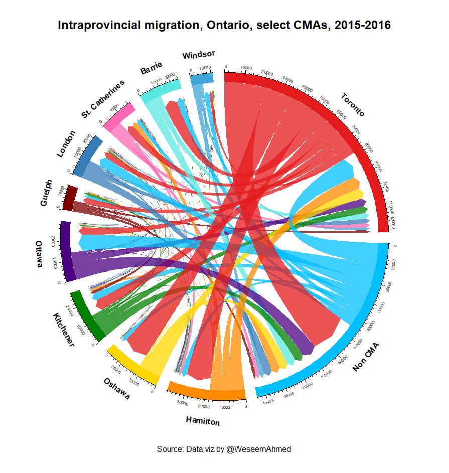
Intraprovincial Migration
For a study on determining if Ontarians are satsfied with their overall quality of life, one of the ideas my colleagues and myself had was to see how people are moving within the province. Following the Dutch people’s influx into Amsterdam during the Middle Ages as a sign of their approval with their government, the concept of “voting with your feet” has been around for quite sometime.
When to use it?
- Chord diagrams are best used when every “thing” interacts with everything else. In this case, people from every city migrate to every other city. Another example that it can also be used for is showing trade relations since (almost) every country trades with every other country.
- It is a visually appealing and novel way of displaying the data while being concise and straight forward.
- The data should be structured in three columns: “Origin”, “Destination”, and “Value” for R to be able to read it.
Creating a chord diagram
To visualize this, I mainly use the chordDiagram() from the circlize package in R:
library(circlize)
After loading in the packages we now need to get our data. For simplicity, everything I use is freely available from Statistics Canada, in this case table 17-10-0087-01. Select which census metropolitan areas you’d like, download the data, and load it into R. Or, if you would like to save time, you can download the my data here.
# Load the data
cities2016<-read.csv(file.choose(), header=TRUE, stringsAsFactors = F)
# Filter for origin, destination, and 2016 value
cities.in.2016<-cities2016[ , c(1,2,13)]
Next we need to set the colours to give each city for easy viewing. For my project I only had a handful of colours to choose from but you can use palettes from RColorBrewer, or select your own using hex colour codes. In addition, we create a simple data frame that will tell the chord diagram in what order we want our cities to appear (going clockwise):
colors <- c("#E41A1C", "#00bfff","#ff8c00","#ffd700","#008000", "#4b0082", "#800000",
            "#377EB8", "#ff69b4","#5ae8e0", "#40A4D8")

city_order <- data.frame(
  c("Toronto", "Non CMA", "Hamilton", "Oshawa", "Kitchener", "Ottawa", "Guelph", "London",
    "St. Catherines", "Barrie", "Windsor")
    )

# Name the column so we can call them easier
colnames(city_order) = "City"
Next, initialize the chord diagram (not unlike a regular plot):
circos.par(start.degree = 90, gap.degree = 4, track.margin = c(-0.1, 0.1), points.overflow.warning = FALSE)
par(mar = rep(0, 4))
And now, simply run chordDiagram().
chordDiagram(x = cities.in.2016, grid.col = colors, transparency = 0.25, order = city_order$City, directional = 1,
             direction.type = c("arrows", "diffHeight"), diffHeight = -0.04, annotationTrack = "grid",
             preAllocateTracks = list(track.height = uh(5, "mm")),
             annotationTrackHeight = c(0.05, 0.1), link.arr.type = "big.arrow", link.sort = TRUE, link.largest.ontop = TRUE)


# From here you can adjust font sizes, line heights, track height, etc. until you are satisfied with the end result.

for(si in get.all.sector.index()) {
  circos.axis(h = "top", labels.cex = 0.5, sector.index = si, track.index = 2)
}
title(main = "Intraprovincial migration, Ontario, select CMAs, 2015-2016", cex.main = 1.5, line = -4)
mtext(text="Source: Data viz by @WeseemAhmed", side=1, line = -5)

circos.trackPlotRegion(
  track.index = 1,
  bg.border = NA,
  panel.fun = function(x, y) {
    xlim = get.cell.meta.data("xlim")
    sector.index = get.cell.meta.data("sector.index")
    city = city_order$City[city_order$City == sector.index]

    circos.text(x = mean(xlim), y = 1.6,
                labels = city, facing = "outside", cex = 1, niceFacing = TRUE, adj = c(0.5, 0), font = 2)
  }
)